In the seven years since it reopened on Benjamin Franklin Parkway in the cultural heart of Philadelphia, the Barnes Foundation seems to have become an unqualified success, at least by most conventional measures. Its elegant new building, designed by Tod Williams Billie Tsien Architects (TWBTA), has welcomed close to two million visitors, staged dozens of temporary exhibitions, brought hundreds of students to its new education spaces, and gradually established itself as a highly prized, and profitable, venue for corporate and philanthropic events.1 Moreover, the Foundation, threatened with bankruptcy a decade ago, has a new board of trustees and a healthy endowment in addition to its $150 million building. Most importantly, the new building has brought the unparalleled Barnes art collection to thousands who would never have seen it in its original location, five miles west in suburban Merion, where visits—by reservation only—were limited to five hundred a week.
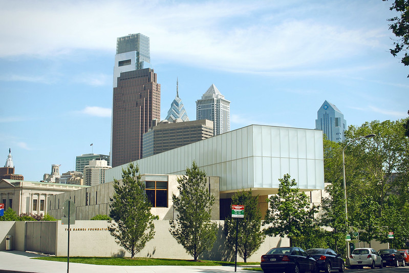
The Barnes’s move was controversial, and the ten years of litigation leading to the Pennsylvania Court’s final judgment to allow the move was recounted at length in contemporary press and a spirited film, The Art of the Steal. A complex web of suits and countersuits had to be resolved to legally void the explicit instructions in Alfred Barnes’s will for the posterity of his collection, divest his handpicked trustees of their fiduciary and moral responsibilities, and establish a new institutional charter that would permit the Foundation and its collection to leave the original site. Throughout, there were echoes of the deep antipathy between Barnes and Philadelphia’s society barons, which had contributed to his choosing a remote site to build the museum in the first place in 1925. Decades later, this ill will seemed to be reanimated in bitter disputes between the few voices that argued to preserve the Foundation in Merion and the vastly more influential and moneyed chorus that offered their generous support on the explicit condition that the museum move. The winning argument was deceptively simple: by moving downtown, the Barnes collection, and the Foundation, would serve a larger and more diverse public, and all those masterpieces hidden away in the suburbs would finally have the audience they deserved. At the time, the controversy played out as a contest between forward-thinking, civic-minded philanthropists and an elitist opposition wedded to a nostalgic and financially unsustainable status quo. With all the noise generated by this debate, the potential impact of the move on the institutional character of the Barnes was obscured, as was any serious consideration of an alternative project that might have secured the Barnes’s future in place. Now that the battle is over and the Barnes has settled in alongside the other cultural temples on Philadelphia’s boulevard of the arts, it’s worth reconsidering both the building and the institution and asking what has been gained, and lost, in this singular act of cultural reinvention.
The idea of the modern art museum develops from a tension between pedagogy and aesthetics, which each collecting institution resolves in its own way. Barnes’s original project was a sui-generis response to that tension, and in the ninety years before the move, his Foundation had become thoroughly isolated from mainstream museum thinking in its robust rejection of art history as an organizing principle for presenting its collection. And it was this rejection of conventional curatorial presentation, coupled with the museum’s isolation from the city, that shaped both the original architecture of the Foundation and its meaning as an institution.2
At its inception, the Barnes Foundation was anything but elitist; in fact, it dramatically redefined the meaning of populist. With the close collaboration of his friend John Dewey, Barnes set out to create a kind of school of experiential learning, an extension of the courses he had integrated into the workday of the employees of his pharmaceutical company, which was run as a cooperative. Barnes believed that access to his collection was best reserved for laborers and common folk, a belief easily mocked, especially by the celebrities and art historians whose entrance requests he regularly refused.3 But Barnes’s convictions regarding the presentation of art presumed that the intended audience for his collection didn’t know the difference between a Renoir and a Gauguin and a Matisse, indeed didn’t know the names of those artists at all. Free from any obligation to situate the art in terms of movements or chronologies—that is, the context of art history—the audience Barnes hoped to address was liberated, as he saw it, to confront the works on their own terms.
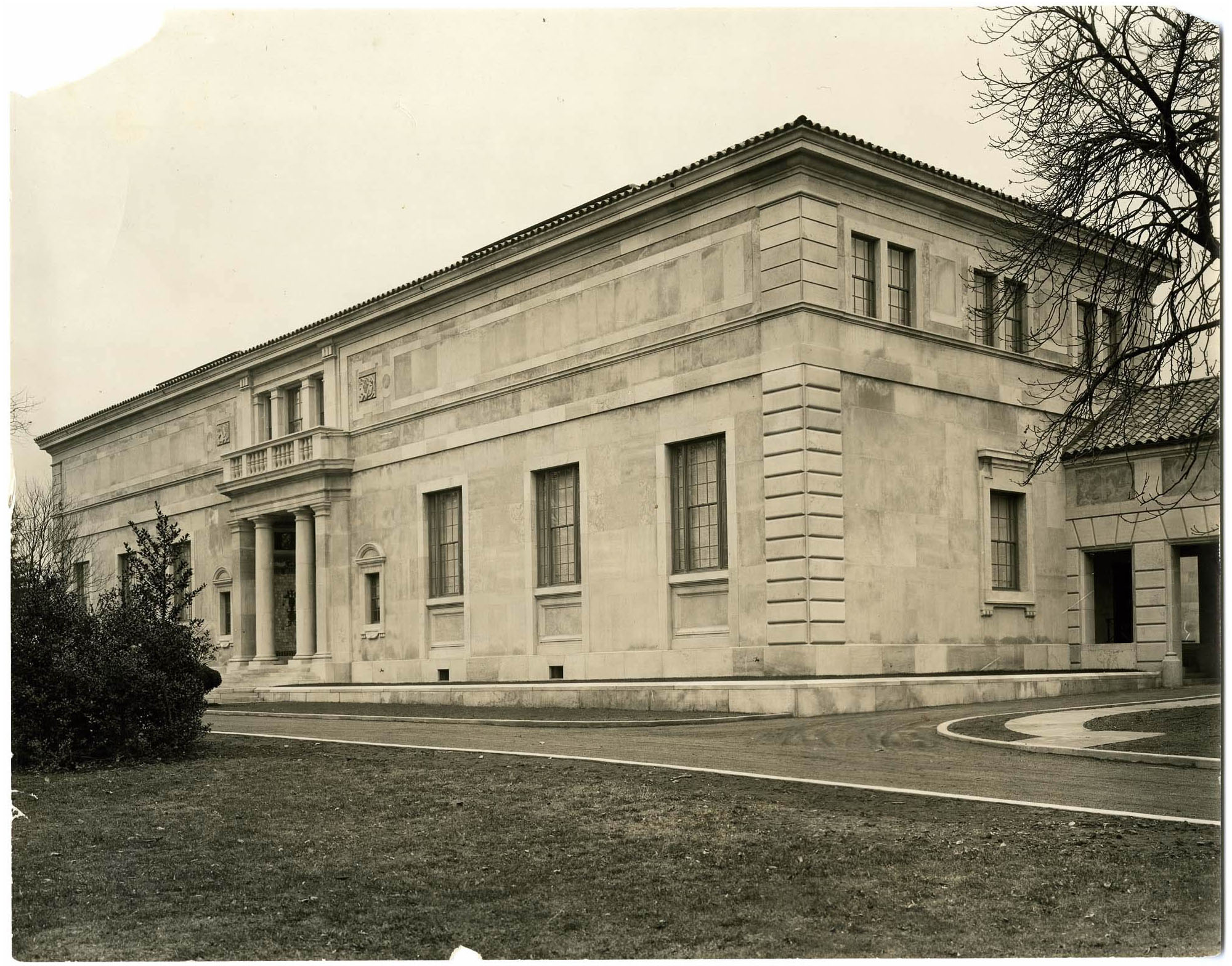
To support this way of seeing, Barnes and his architect Paul Philippe Cret conceived a space of inquiry, where the works on the wall, in the three-dimensional space of the room and by extension, the four-dimensional temporal sequence of the entire building, formed an orchestrated display of aesthetic evidence.4 Within Cret’s beautifully proportioned galleries, which referenced domestic scale and plan arrangements while substantially enlarging them, Barnes’s installation was a kind of memory theater, a free-form rebus of structured meanings. The symmetrical pairings and idiosyncratic groupings of paintings and objects were meant to induce observations, associations, and intuitions that could be played with and eventually deciphered in ways that spoke not simply to the individual canvas or object but the vastly greater sum of aesthetic, scientific, and even moral intentions that Barnes was convinced were central to the entire enterprise of “modern” art.
The fundamental text on the Foundation’s methodology is Barnes’s own The Art in Painting, which is based on his experience both as a collector and an educator. In the book, his aim is to provide a detailed methodology for the understanding of art on a scientific basis. Barnes acknowledges an intellectual debt to Dewey and to Santayana and sets out his own specific focus:
Barnes insisted on the primacy of direct experience of the work of art and the rigorous interpretation of the sense perceptions the work aroused, writing that, “what is claimed is that the method gives results as objective as possible within any field of aesthetic experience and that it reduces to a minimum the role of merely personal and arbitrary preference.” Instead, he said, “our intention is to offer a type of analysis which should lead to the elimination of the prevailing habit of judging paintings by either academic rules or emotional irrelevancy.”5 The methodology laid out by Barnes and his colleagues sought to clarify and isolate aesthetic values that were derived from the interplay of subject matter (or substance), form, technique, and plastic values. The method proposed that “plastic unity” in form resided in the particular balance of color, line, and composition as combined with subject matter and varied with the vision and skill of each artist. What Barnes wanted to encourage was an understanding as multiple and variegated and as freely associative as the individual experience of each viewer; he hoped that the works shown in his gallery would be understood formally, chromatically, experientially, and in terms of their ontological qualities.
To Barnes’s way of thinking, there was no preferred sequence or hierarchy to this potential stream of understanding; the first-time visitor could engage with any given set of works in any of the galleries. If, for example, the attentive (but unschooled) viewer noticed that the rosy pink of the sand in Gauguin’s Tahitian landscape was the same hue as the broad backs of Renoir’s pair of nudes to either side of it and was repeated again in the medallions on the eighteenth-century Pennsylvania Dutch chest just beneath it, there was a lesson about the nature of color and how it is perceived. If depicted sand and flesh and real wood surface can all participate in a kind of visual equivalence, then some nascent understanding of light and how it conveys information to the retina is close at hand.
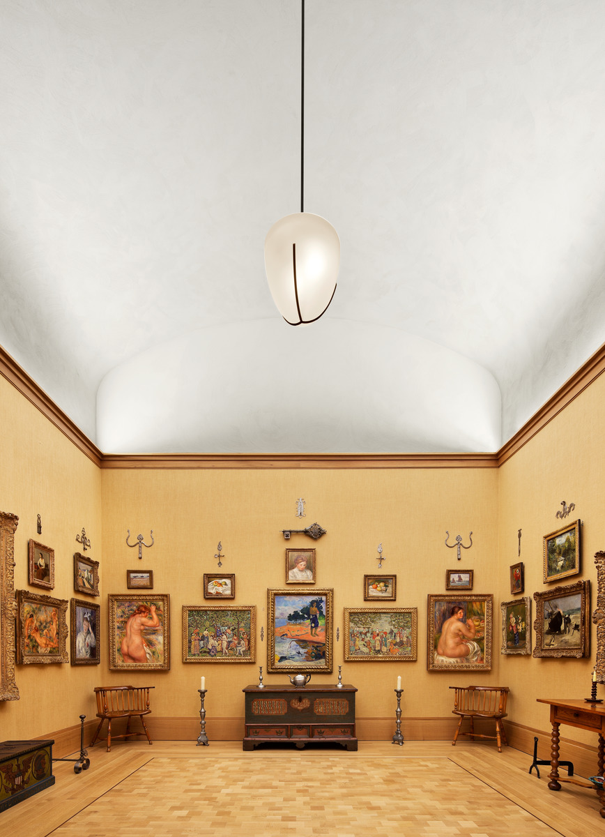
Then there was Barnes’s infamous habit of mixing art and artifact, hanging priceless nineteenth-century paintings with fragments of metalwork from across the ages. Above Gaugin’s landscape and Renoir’s nudes were arrayed a series of forged metal tools and, standing on the floor just in front of them, a pair of early American wooden chairs. So if the viewer found that the curves of the trident metal pieces above recalled, with a graphic, almost graffiti-like abstraction the precise outline of the paired Renoir buttocks, then this encouraged a reading of correspondences in form and line across two- and three-dimensional objects without the slightest functional or direct historical relationship. Nor did the “crafts” pieces serve simply to elucidate the hidden messages of the “art”; Renoir’s sensual curves evoke the uncannily anthropomorphic qualities that utilitarian objects often have and attest to a visual vocabulary that transcends an object’s purpose. And if the same viewer saw the broad, subtly curved seats of the paired wooden chairs just under the nudes and imagined a slow downward slide of those bodies, through the gilded frames toward those seats and thus, in the mind’s eye, conjoined that pictorial space with the space of the room itself, there were potential lessons in the uses of illusion, the continuity between “imagined” and “real” space, and perhaps also in the unstable, disquieting presence of nakedness thus exposed to the spectator’s gaze.
In short, Barnes’s museum was as a glorious machine for teaching conceptual relationships and the interrelatedness of distinct categories of meaning; and it is this that has been lost, as much in the Foundation’s move downtown as in the nine decades that have elapsed between the opening of the original Barnes and the new one.
Visitors can no longer look at early modern painting as Barnes’s idealized laborers were supposed to; today the names of the artists in the Barnes collection are household words, and most schoolchildren have at least a passing acquaintance with what a modern painting is and why it hangs in a museum. And the long argument about moving the collection was ultimately not about the preservation of Barnes’s eccentric installation as a meaningful, living pedagogical tool but about where masterpieces should be seen. Barnes certainly understood that his collection contained masterpieces, but, for him, that was the least interesting thing about it: he saw the collection as a means of teaching greater and more varied lessons and both the how and the where of its installation were essential to his project. It is this faith in art as an active instrument for understanding the world that had been lost long before the move, and it is this loss that the building by Williams and Tsien memorializes, indeed monumentalizes. Thus, the new Barnes represents a simplification of intentions, a reduction to a lower common denominator that substitutes more conventional approaches to viewing art for an ambitious and less easily defined pedagogy of hard-won understanding and the individual effort it requires.
One might ask why Barnes’s pedagogical method can’t exist in this new building? After all, by the court’s mandate the actual sequence of rooms and the hanging of the collection on both floors are rigorously identical in the new installation—the Barnes Foundation has always been at pains to insist to its critics that all the galleries have been rigorously “preserved.”6 The only modification in the actual presentation of the art is the introduction of a careful mix of natural and indirect artificial light—an almost invisible, largely technical innovation that results in a remarkably improved visibility of the works on the wall. So, what’s not to like?
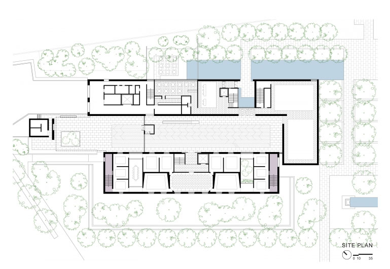
The faithful reproduction of the original rooms has been beautifully realized. For those with a mental image of the Merion galleries, in Philadelphia one has the dreamlike sense of standing in a slightly more crisp and vibrant version of remembered experience. However, the architects have added two symmetrically disposed, courtlike spaces to the gallery plan, one a classroom and the other, an intimate interior garden. While these are welcome, graceful volumes, their introduction stretches Cret’s rectangular plan and elongates the circulation along the perimeter edge by making four significant breaks in the presentation of the art. These gaps in the sequence work as “neutral” corridors that separate groups of galleries, a kind of sorbet or palate-cleanser between main courses. They also have the practical effect of lengthening the visitor circuit on both levels, providing more physical space to accommodate larger crowds and thus thinning out the number of visitors standing in front of the art at any given moment. But as clever and functional as these modifications may be, they interrupt and subtly change the rhythm of the galleries that Barnes and Cret had worked so carefully to balance, and they tend to reinforce a single prescribed circuit, so the inventive serendipity of each visitor’s wandering at will from one room to the next at Merion has now been reduced to a fixed path through the works that is now essentially the same for all.
But the greatest problem with the new Barnes is the move to downtown itself. The aspect of pilgrimage involved in getting to the old Barnes was integral to its meaning: its eccentricity was central to its purpose. Not being in the city, not being just another in a line of august cultural temples, was its first and in some ways its fundamental claim to attention and affection. One couldn’t simply stumble into the Barnes Collection. The visit began with its planning, with the advance application to be admitted among the limited group of visitors on a predetermined day, with the trip to Merion, a twenty-minute drive from downtown Philadelphia, just long enough to leave the city’s rhythms at some meaningful distance and enter into a setting that was designed for a different sense of time as much as anything else. The volumes of Cret’s modest building and its setting in the carefully designed arboretum were all attuned to the temporal suspension and removed from everyday experience that Barnes had so painstakingly planned.
Tod Williams and Billie Tsien implicitly acknowledge these issues in the siting of the new building through its careful, complex entry sequence. Their museum turns its back on the parkway, and visitors are first led around the side and along a new façade, set in a densely planted grove of trees, before reaching the monumental front door. But this bit of choreography works symbolically, not experientially, because the scale of the building overwhelms the fragile, indirect path of approach. The landscaping, for all its charms, feels as if it’s meant to represent the lost arboretum of Merion, rather than reproduce it. It is too timid and subtle as a nod to the past, and as a setting for the new building, it is overshadowed by all the infelicities of an urban context that it can’t quite shut out.
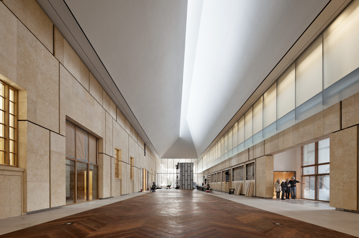
The entry opens into a large and imposing atrium, a handsome volume covered with a light box of angled planes that manages to make the blanched sky of Philadelphia give up a soft, luminous warmth. Compositionally, the atrium serves to separate the administrative programs of the Foundation from the gallery wing. During the day, it is used as a lobby and meeting space, and at night it glows as a beacon marking the presence of the Foundation on its new site. But the atrium also serves as a set piece, another “neutral” volume to counterbalance and provide some breathing room for the smaller gallery wing, which has been clad in staggered blocks of fossilized limestone to evoke the scale and façade of Cret’s original. Yet, here again, the effort to create a transformed facsimile of the original experience only serves to underscore how different the new arrangement is. Size matters, scale counts; the drama and bombast of the new Barnes atrium overwhelms the delicacy of what it intended to honor and preserve.
There is a considerable amount of new program space as well—the gallery for temporary exhibitions, an auditorium, classrooms, a café and dining courtyard, an enlarged gift shop, and conservation lab—in short, the requisite support apparatus of the contemporary cultural tourist center. Much of this is placed below grade, separated from the gallery sequence and connected discretely to the atrium with an elegantly detailed stair. Yet this subterranean education and support space quietly undermines the mission of the institution as Barnes had defined it: Barnes was convinced that learning about art could only happen in front of the art, in its space; if that meant that there were limits to how many could learn at once, well then so be it. In seeking to expand its programs to the widest possible audience, the new Barnes betrays the very mission it purports to uphold.
This is finally the paradox of the new Barnes: some experiences of art cannot be presented to more than a limited number without subtly but profoundly altering what that experience means. The pluralistic, inclusive, expansionist impulse, for all its laudable intentions, always runs the risk of denaturing the very experience it seeks to share more broadly. By making itself accessible, by simplifying the terms of engagement, the Barnes has made itself into something different. Whether that is better or worse, more contemporary, or more popular or populist or profitable, is finally not the point—it is no longer exceptional, just another version of any number of other urban art museums.
The main problem with the project then is not that Tod Williams, Billie Tsien, and their colleagues are not gifted architects, nor that their expanded Barnes is not full of felicitous volumes, beautifully assembled materials, and refined details. Clearly little expense and none of the designers’ talents were spared in creating the new building. But all of those resources have been brought to the wrong problem; the architects have given an exquisitely sensitive, even eloquent answer to a question that the Barnes Foundation should have had the courage, and imagination, not to ask.
-
A 2014 press release from the Foundation tracked annual attendance at more than 325,000 visitors. By June of 2017 the total figure for visitors to the new building had surpassed 1.2 million. See Barnes Foundation, “Derek Gillman Steps Down as Executive Director and President of the Barnes Foundation on January 1, 2014,” press release, December 2, 2013, link; and Barnes Foundation, “The Barnes Foundation Celebrates Five Years on the Benjamin Franklin Parkway with Series of Programs and Events for the Public,” press release, June 11, 2017, link. ↩
-
As Judith Dolkhart explains, “…Barnes experimented with the display of his collection, arranging and rearranging the works in ‘ensembles,’ distinctive wall compositions organized according to the formal principles of light, line color, and space rather than by chronology, nationality, style, or genre.” See Judith Dolkart “To See as the Artist Sees,” in Barnes Foundation: Masterworks, eds. Judith Dolkart and Martha Lucy (New York: Rizzoli, 2012). James Panero describes Barnes's pedagogy similarly: “Deeply impressed by John Dewey’s Democracy and Education (1916), Barnes believed that the development of cognitive skills, rather than the memorization of facts, was the key to education.… Barnes let the harmony of shapes and forms sing for itself. He wanted his collection to enliven the eye, not confound it with facts.” See James Panero, “Outsmarting Albert Barnes,” Philanthropy, 2011, reprinted at Philanthropy Roundtable, link. ↩
-
A fact sheet for the Barnes Foundation states: “Barnes’s intended audience for the Foundation included factory and shop workers, poor and disenfranchised people, African-Americans and young artists. The Barnes educational method was based on experiencing original works, participating in class discussions, reading key texts in philosophy and the traditions of art and looking objectively at the use of color, line, light and space in each work of art. Barnes believed that students would not only learn about art but also would improve their critical thinking and their ability to learn and succeed in general, enabling them to be more productive participants in a democratic society.” See Barnes Foundation, “The Barnes Foundation: A Brief History,” fact sheet, link. ↩
-
Cret specifically designed the gallery rooms with windows, favoring natural light for viewing art. This deviated from the typical art museum façade and “escape[d] from the character that has earned for art galleries the definition ‘cemeteries of works of art.’” Paul Cret, “The Buildings of the Barnes Foundation at Merion, Pa.,” Architecture, vol. 53, no. 1 (January 1926): 17.
To see as the artist sees is an accomplishment … [that] requires not only the best energies of which we are capable, but a methodological direction of those energies, based on a scientific understanding of the meaning of art and its relation to human nature. The artist illuminates the objective world for us, exactly as does the scientist, different as the terms are in which he envisages it; art is as little a plaything, a matter of caprice or uncontrolled subjectivity, as is physics or chemistry.[^5]
-
Barnes, Art of Painting, preface to the third edition. ↩
-
The Foundation notes the terms of Barnes’s will and the “Indenture of Trust” with which the Foundation was established in 1922 and that governs the disposition of the collection. It asserts that the specific arrangement of the paintings within the gallery should survive him and his wife. The Indenture governed the Foundation throughout the remainder of Dr. Barnes’s life, until his death in 1951. It continues to govern the Foundation, in amended form, today. See Barnes Foundation, “Relocation of the Barnes Foundation,” fact sheet, link. ↩
Stephen Rustow is the founding principal of Museoplan and a professor of architecture at the Cooper Union.

