We wanted shapes and creativity that we could all afford and we put the color in just to make it a little sexy. ... It’s supposed to inspire people. ... We wanted people to drive by and sort of say, “What the...?”
—Seth Polen, Developer1
What meaning, if any, can be assigned to the affordable and creative shape that adorns the entrance of 915 Mateo in Los Angeles? The faceted metal scrim that extends from the sidewalk to the roof serves no obvious purpose; it is an independent structure, suspended from the concrete walls of a freestanding warehouse, open to the elements at every edge, difficult to clean, and redundant as a sun- or rain screen since it covers areas that are almost exclusively opaque and impermeable. These nonfunctional characteristics give the scrim a kind of surplus quality as an accessory to the no-frills renovation behind it. If the façade, in Gottfried Semper’s Four Elements of Architecture, could be described as dressing or bekleidung—a symbolic covering that simultaneously dematerializes and articulates the “structural technical” core of the building—here, the metal scrim acts more like a fascinator: a tiny decorative hat that seems to announce, “It’s a special occasion [for creative loft living].”2
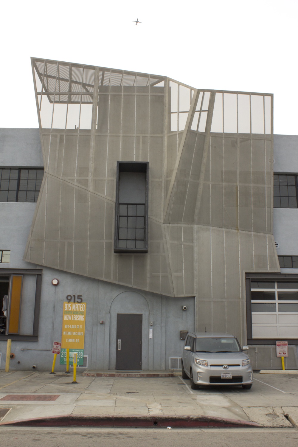

In this sense, the scrim could be interpreted as a sign, allowing the building as a whole to fall into Venturi and Scott Brown’s category of the decorated shed: “Where systems of space and structure are directly at the service of program, and ornament is applied independently of them.”3 Certainly the metal scrim is an outwardly applied decoration, and its arbitrary folds, polygonal profile, and light materiality have little relation to the underlying utilitarian architecture of the warehouse. However, the scrim does not carry the explicit and denotative meanings that Venturi and Scott Brown celebrate in their readings of the billboards of Las Vegas, the vernacular architecture of Philadelphia, or in their own repertoire of complex and contradictory façades. If the scrim is a sign, then what is it signifying? In the developer’s optimistic scenario, a passerby is rendered speechless, not by specific associations, but through a general incomprehension. And in the ellipsis of Polen’s imagined exclamation, “What the...?”, any number of interpretations could be accommodated. Like the open floor-plans of the warehouse, the scrim invites the most recent micro-enterprises, flexible machinery, and municipal tax incentives to pass through it without making any claims for exactly how they will be used.
Since 2005, when Polen and his partners, Brent Held and Greg Celeya purchased the property, much of the surrounding warehouse district has given way to light industry and loft conversions, spurred in part by a business tax holiday instituted by then-mayor Antonio Villaraigosa and the area’s designation as a State Enterprise Zone. Today, 915 Mateo’s tenants include a company that manufactures and distributes artisanal medical apparel, a “brand development laboratory” called Nacholand, an interactive media consultant, a leather wholesaler, a concrete countertop fabricator, a photographer, an art gallery, and an architecture firm. These diverse endeavors take place in nearly identical spaces: 1,000- and 1,200-square-foot units that have been minimally fitted out, leaving the structure intact, plumbing exposed, and concrete flooring “raw” with the option to polish.
Described as “creative-flex” by the developer, a derivation of the more common category “flex-space” that is used to indicate a combination of office and light manufacturing, the architecture is devoid of any specific qualities aside from its obvious emptiness. Creativity could be understood here as the realization of a certain potential, implied in the sheer availability of the space. “I could really do something here,” a porcini magnate might exclaim while excitedly pounding on one of the mushroom columns. Once a site of storage, the building is now presented as a space of intense output, ranging from the most concrete of countertops to the most immaterial “experiential marketing ideation” performed by the gurus of Nacholand. As these activities have shifted, with new tenants cycling through and old ones annexing additional units, the public listings and announcements of the building have remained strategically vague.
A small animation loops continuously on the website that markets the building, a sort of architectural trailer increasingly used to promote these kinds of ventures. Here the camera cycles from a panorama of the downtown Los Angeles skyline to an interior shot of a generic loft space to a stock photo of a young woman in overalls, leaning against a wall of weathered-steel panels, as if taking a break from some especially taxing brainstorm. A banner scrolls across each image: “In a city with creative designs. ... In an area known for inspired results. ... To a place that lets you express yourself ... 915 Mateo.”4
The scrim and the young woman emblematize these entrepreneurial, highly personal expressions. If the scrim is an exciting material product, a creative outgrowth of the ultra-functional warehouse, the woman is a latter-day impannatrice—a kind of excellent subcontractor. Purchasing raw materials, organizing her employees, bringing her small-batch products to market, she shapes the vanguard fashions of the moment. Nevertheless, the scrim and the woman also clearly promote an ideal form of flexible specialization conjured in the developer’s visual rhetoric. It is an image devoid of the poor safety conditions, unpaid overtime, shirking of tax codes, striking gender gaps, and general lack of social integration that increasingly typify the converted warehouse districts of Los Angeles and elsewhere. These brave new conditions are unintentionally alluded to in the final photo of “Community” at 915 Mateo.5 Here the same young woman squats in a shadowy derelict brick alley next to the building. She dons an oversized white hoodie over dyed black hair and looks somewhat emaciated. UGGS, distressed jeans, and overlapping goth bracelets dangling off the wrist round out a homeless-celebrity look that became popular in the early 2000s during the bad starlet wave. These looks seem to shepherd a set of Los Angeles icons into the realm of small-scale production and commerce, offering the advertisers, producers, and consumers of this world motivational images to guide their activities according to the norms of lean production.
But the norms of flexible production in Los Angeles were not always so lean, nor was its corresponding vernacular architecture. The scrim has slowly thinned over the course of Los Angeles’s late twentieth-century architectural avant-garde. Writing in 1984 on the hallmarks of a then nascent LA Style, Charles Jencks promoted a strain of exhibitionism within the buildings of a new school of West Coast designers: “Eric Moss is a weight-lifter and his buildings bulge with the ripples and pectorals of the golden-haired Herculeses one can find showing their wares on Muscle Beach. LA Style shares with Muscle Beach its explicitness: it flexes its architectural biceps on the street, so they can’t be missed.”6
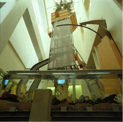
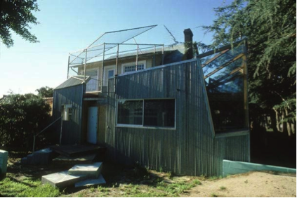
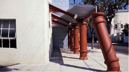
In this dramatic interpretation, the static and inanimate elements of Moss’s architecture are imagined as living tendons, bursting out of their traditional confines through heroic effort. These kinds of staged displays played out across the city, beginning in the late 1970s with Frank Gehry’s double-wrapped Santa Monica House, to Eric Owen Moss’s plumbing columns at Paramount Laundry in Culver City, to Morphosis’s “play sculpture” inside the Cedars-Sinai Cancer Center in Beverly Hills. Alternately labeled “plus modern,” “technomorphism,” and “en-formality” by the numerous architects and critics who sought to unite the work under the banner of a cohesive school, many of these projects involved the juxtaposition of some standard structure with a fragmented, layered, and didactic assembly of “as found” materials—exposed concrete, weathered steel, chain-link fence, plywood, corrugated aluminum, and with increasing frequency, metal scrim.7
Although scrim had been used for many years as reinforcement for plaster construction, it was introduced as an expressive element on the façade of Gehry’s Santa Monica Place parking garage in 1980, bearing the name of the mall in gigantic lettering. The scrim became a staple of Morphosis’s stratified “dead-tech” façades, beginning with a curved topiary wall for the unrealized MTV studios in 1990, through to the Salick Healthcare Office in 1993, and most extensively in the façade of the Caltrans Headquarters, constructed in Downtown Los Angeles in 2005. Like the early Santa Monica Place façade, the Caltrans scrim acts as both sign and filter, displaying the address of the building while sheltering the windows of the offices inside. In more recent years, as elaborate, multilayered façade systems have become one of the fads of sustainable architecture, the scrim has become associated with “green building.” It is both a sacrificial covering and a symbolic gesture toward environmentalism. In these building envelopes, the scrim, which was once meant to recall ruined technology, is now described in organic terms as “breathable skin,” returning to the animism of Jencks’s original interpretation while substituting bodybuilding with a passive and benign building-body.8
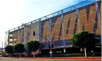
The scrim at 915 Mateo recalls this history, although the signal is weak. Neither as comprehensive as Gehry’s chain-link walls, nor as ornate as Moss’s mangled elevations, nor as useful as the LEED platinum skins that wrap our newest towers, the Mateo scrim occupies a mediocre peripheral zone, at a remove from the debates and preoccupations that informed its forbearers. The scrim belongs to a set of derivative furnishings, including the baffle ceiling, backlit wall fixtures, and horizontal slat partitions that point toward historical precedents, while also signifying an environment of design that is sufficiently contemporary.9 These elements are often manufactured en masse, in panel form, and specified by architects and clients as part of a stylistic selection among an abundance of options. When placed within this array, it is easy to imagine alternative outcomes for the façade of 915 Mateo—a vertical trellis made from locally sourced wood, a modest glass canopy with stainless-steel hardware, or a full treatment of ceramic tiles that have been staggered and spaced in a random pattern. In the interference between the distant aftershocks of LA Style and the larger reverberations of architectural mass production, the scrim emerges as the most likely scenario and the path of least resistance.
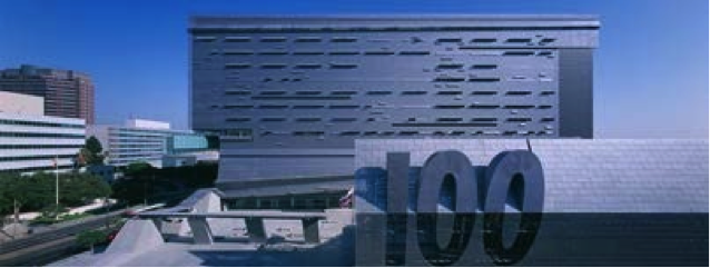
Almost forty years removed from the initial provocations of the Los Angeles avant-garde, the canonization of these figures is in full swing, with a number of recent publications and exhibitions dedicated to the formation of Sci-Arc, the activity surrounding the Venice Gallery, and collaborations between architects and artists in the 1970s. A major retrospective of Frank Gehry’s work, on display now at the Centre Pompidou, constructs a determined progression through six phases, from the 1964 Danziger Studio to the most recent design of the Louis Vuitton Foundation in Paris—a building that is sheathed not in scrim, but with glass “sails,” and which François Hollande has recently declared a “miracle of intelligence, creativity and technology.” Passing beneath the Mateo scrim, the young artisans and Web entrepreneurs of Los Angeles’s warehouse district anticipate their own minor miracles. But perhaps these hopes are themselves a front or façade. The scrim is a last touch on a building that never had much of a hand to begin with, and a sign of closure for an LA Style that is only now becoming understood.
-
Ryan Vaillancourt, "Flex in the City," Los Angeles Downtown News (December 22, 2008). ↩
-
Gottfried Semper, The Four Elements of Architecture and Other Writings, trans. Harry Francis Mallgrave and Wolfgang Herrmann (Cambridge England: Cambridge University Press, 1989). ↩
-
Denise Scott Brown and Robert Venturi, Learning from Las Vegas: The Forgotten Symbolism of Architectural Form (Cambridge, MA: MIT Press, 1977), 87. ↩
-
“Welcome to 915 Mateo Street—Los Angeles, California,” codelinemarketing.com/915mateo. ↩
-
“Community,” codelinemarketing.com/915mateo/community.html (accessed July 9, 2014). ↩
-
Charles Jencks, “LA STYLE/LA SCHOOL. Los Angeles Now,” AA Files 5 (1984), 90. ↩
-
In a lecture published within AA Files in 1981, Peter Cook describes Gehry’s early projects, from the Danziger Studio to the Santa Monica Shopping Mall as “pushing the game” of architectural modernism, or “plus modern” as opposed to postmodern. Peter Cook, “Los Angeles Comes of Age,” AA Files 1 (1981–2). Aaron Betsky would later group the Los Angeles architects Morphosis, Michele Saee, and Neil Denari under the heading “Technomorphism” in his survey of contemporary architecture from 1990. Aaron Betsky, “Technomorphism,” in Violated Perfection: Architecture and the Fragmentation of the Modern (New York: Rizzoli, 1990). Although Jencks used the impartial “LA Style” term in his 1984 review, he would adopt “en-formality” for his extended discussion of LA architecture, urbanism and demographics in Heteropolis. “En-formality is more than a style and approach to design, it is a basic attitude for the world, of living with uncertainty, celebrating flux and capturing the possibilities latent within the banal.” Charles Jencks, Heteropolis: Los Angeles, the Riots and the Strange Beauty of Hetero-Architecture (London: Academy Edition, 1993), 59. ↩
-
See, for example, the biologist-turned-architect, Doris Kim Sung’s recent TED talk “Metal that Breathes” https://www.ted.com/talks/doris_kim_sung_metal_ that_breathes. Kim Sung works with “smart materials” using parametric modeling software to achieve the “dynamism, responsiveness, and differentiation” of human skin and eyelashes. ↩
-
Some combination of Sverre Fehn’s Nordic Pavilion, James Turrell’s Afrum 1 installation, and Paul Rudolph’s wooden screens from his Healy Guest House would produce a convincing Japanese fusion restaurant. ↩
Samuel Stewart-Halevy is an architect and writer. He is teaching currently as the Wortham Fellow at the Rice University School of Architecture and working on a book about architectural drawing in the age of outsourcing.

